Background and challenges
Inherited complexity: Unlocking a 3-year strategic initiative
I joined the Cloud Build team to lead the final design push for the 2nd Generation—a critical, multi-year strategic update to Google Cloud’s CI/CD platform. The primary product goal was to migrate to an open-source architecture (Tekton) to deliver superior flexibility, fine-grained control, and future-proofing for enterprise CI/CD configuration, so that we could attract more customers who were blocked from adopting Cloud Build due to these missing features.
The technical/UX bridge
The architectural shift in the 2nd Gen introduced a powerful new paradigm: triggers become part of the new first-class object, “workflow”, which supports a new layer of “tasks”, and a task consists of steps. My role was to translate this technical complexity into an intuitive UX, making the new paradigm clear to users.
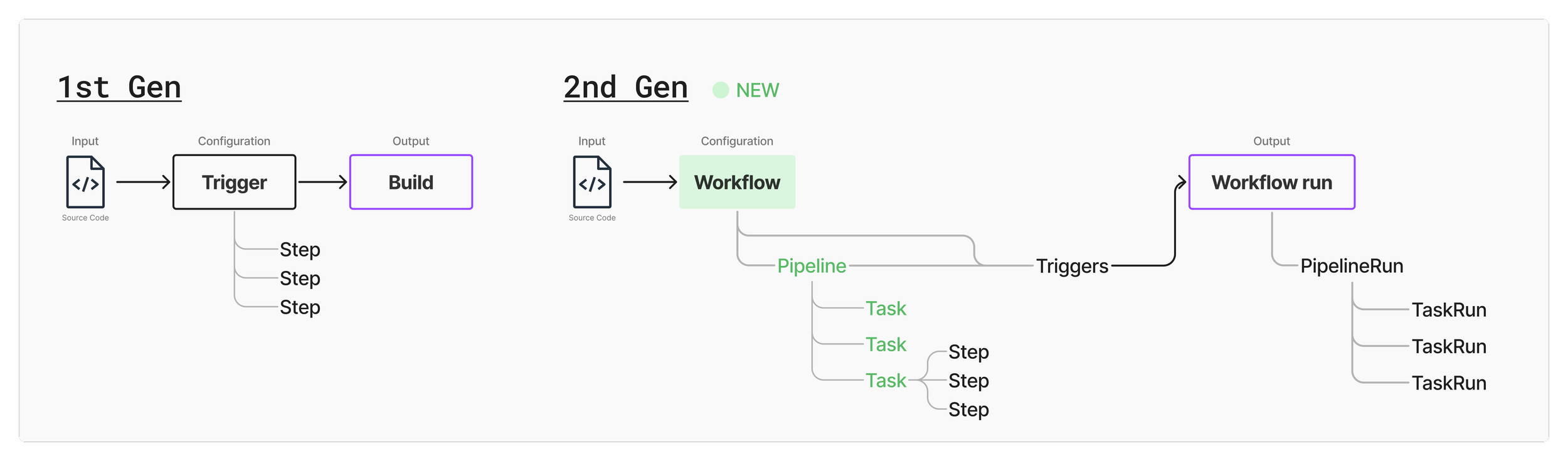
Architecture comparison between the 1st Gen and the 2nd Gen
High-level user flow:
Creation and configuration: A developer writes code and needs to build and deploy it to production for their users. The developer then comes to Cloud Build to set up a workflow and triggers (e.g. when the code is merged into the main branch).
Monitor and troubleshoot: When the conditions defined in the triggers are met, the workflow starts to run. The developer then comes back to Cloud Build to check on the build status.
An analogy that compares a software build process to baking a cake
Cake-baking analogy:
You have lots of ingredients (code). You might have your own recipe or an existing one (workflow).
The recipe defines a sequence of steps to follow to make sure your cake will be successful (build tasks and steps).
Because your friend’s birthday is coming (trigger), you have to start making a cake (start a workflow run).
Once the cake is baked, it’s now something that everyone can eat (program that can run on a computer).
Quickly established design leadership & velocity
The core challenges for me were velocity and convergence. I was asked to
drive consensus among cross-functional stakeholders,
stabilize the design direction after 3 designers and 3 years of iteration, and
work with engineers to get the product to a launch-ready state.
My immediate goal was to quickly master the Google Cloud Platform (GCP) design system and establish a decisive, collaborative pace with my new cross-functional partners.
To make sure I ramped up quickly and my product understanding was correct, I met with PM and engineering leads frequently to walk through my diagrams and progress to get feedback and confirmation. I also did a competitive analysis on main competitors: GitHub Actions, GitLab CI, and Jenkins.
My key focus areas
My first priority was to close out remaining designs from the previous designer, and to create new designs for missing pieces in the user journey.
Monitoring experiences after builds are kicked off (iterations from previous designs):
Redesign the dashboard for better scannability
Visualize workflow runs to ease troubleshooting
Redesign the workflow details page navigation to reflect the new architecture
Creation and configuration of workflows (new designs):
Restructure the information architecture of the configuration form into an logical grouping and order
Enhance pricing transparency
Dashboard redesign
Previous design made by another designer
My new design
It’s challenging to fit a chart and many data fields in the previous 2-column card-based design, so I worked closely with my frontend engineer to discuss his implementation concerns and iterated through different layout options that improved visual balance, scannability, and responsiveness. I also brought in PM to learn about user needs and importance of each data field.
The final design makes each card full width for users to interact with the chart more easily, and aligns the “last run” data to the right where the corresponding column in the chart is.
Workflow run visualization
Previous design made by another designer
From the dashboard, a user can click on a column in the chart or a last run link to view the details of a run, usually a failed run to see where went wrong.
Given the new 3-layer architecture (workflow > tasks > steps), the goal was to let user quickly identify the error and troubleshoot it.
My new design
Added a breadcrumb navigation on the top
Each card in the visualization represents a task, and an error occurs at a step level. In the new design,
I surfaced the error message to the front and showed the failed step in the visualization.
Once user dived into the error and log, I oriented them with a breadcrumb navigation on the top to indicate which level they were at.
Design options of the visualization
I explored multiple options and discussed with my engineering partner before arriving at the final decision. Because errors occur at a step level, my goal was to let users easily see step information while still having access to see the big picture of the entire workflow logic.
We agreed that option 4 was the cleanest and clearest approach, and the engineering effort was more manageable compared to other options.
Workflow details view
From either the dashboard or the workflow run page, user can click on the workflow name to check or edit the configuration, if they realize an error is due to a misconfiguration.
Previous design made by another designer
My new design
This workflow details page contains similar information as the dashboard, and it’s the other entry point for users to pin a trigger card to the dashboard, so my goal was to create standardized components or layouts that could be shared across different pages to create a consistent experience. In my new design,
I moved the workflow-level information card above the tabs to create a clearer information hierarchy.
I also addressed a missing requirement to show manual runs that weren’t started from a trigger.
I grouped the chart, data fields, and the table into one card to better organize them together.
I reduced the information load and repetitive data also shown in the table in each card header, given the table below was already heavily dense with data.
I matched the card header layout as the dashboard cards to have the chart towards the right. This also provided better scannability of status icons aligned to the left.
Workflow configuration
Now let’s look at the creation and configuration experience.
The workflow creation form hadn’t been touched for a while. Initially I got a couple requirements from PM to add new features and form fields. However, the form quickly became very long without a consistent section header style.
I took the initiative to regroup and reorder the form to reflect the importance of different fields in the setup flow, and reviewed with PM and engineers.
Before: a long form with too many sections
After: a re-prioritized order of section and collapsed less common sections
Pricing
This is a self-initiated effort starting from a requirement to support more machine type options (from previously 5 options to 64).
Aside from replacing a giant dropdown with an existing component with category tabs, I proposed adding a price calculator to the side of the machine selection page to enhance pricing transparency. Without an in-product price calculator, a user had to leave the product, manually find our documentation, and figure out an estimate from a big pricing matrix.
User study before launch
Last user study done on this project was almost 2 years ago and designs had evolved a lot since, so I designed and facilitated a 9-session user study to collect user feedback to inform final adjustments before launch.
In addition, I invited my engineering partners to the sessions to spectate and take notes. My engineering partners shared very positive feedback about this process which was new to them. It was highly effective in building user empathy across the cross-functional team, validating the design direction and enhancing overall product quality awareness. As a result, two bugs were fixed by engineers right away after they saw the friction users experienced first hand.
High-level findings
Users were happy to see some features become available in the 2nd Gen. On the other hand, all of them shared a common pain point about the log viewing experience. This had been a long time user complaint in our product feedback surveys as well. I shared this finding with the team and successfully got support from PM and engineering to address this problem as a top priority!
Before: Hard to select to copy logs. No color highlights on error lines. Cumbersome to view raw logs.
After: More compact view. Color highlights. Click to copy a direct link to that line.
Another notable feedback from the users was that most of them expressed hesitance to migrate from the 1st Gen to 2nd Gen unless it’s mandated because they worried about disruptions and didn’t want to change things that were already working.
Lesson learned
Despite the project being ready and validated, it was cancelled last minute due to a strategic organizational decision concerning post-launch engineering resource allocation. This result provided a critical learning moment for the entire team: a commitment to iterative development and constant incremental shipping is essential to mitigate large-scale project risk and validate market fit continuously.